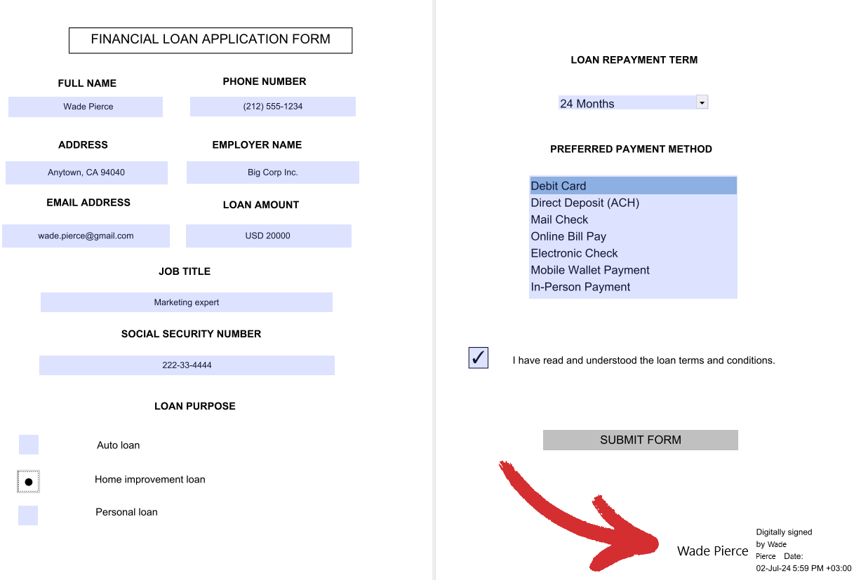
Creating custom forms
Sometimes, you may have a hard time finding a ready-made form template to use as your own. This is where MobiPDF’s feature to create hand-crafted forms can really come in handy.
Accessing the forms tool
There are two ways to access this feature. If you haven’t opened a document yet, you can access the forms editor by going to “More” → “Edit Forms” from the “Home” menu.
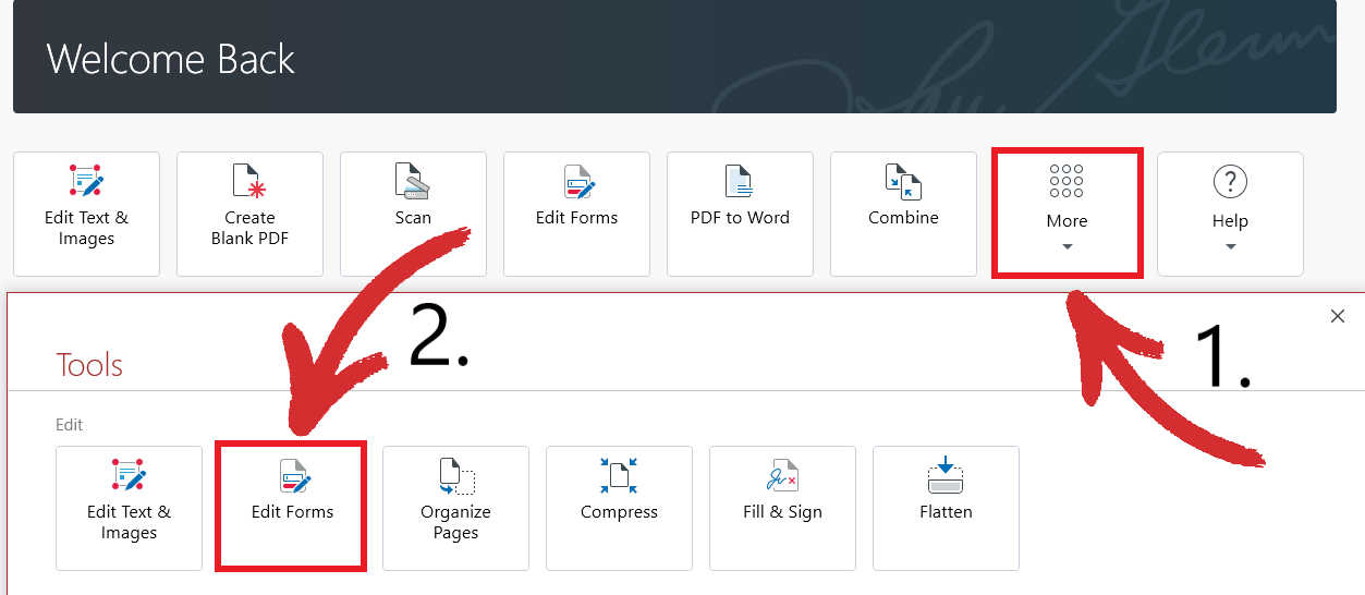
Alternatively, if you have a document or a blank PDF already open, simply click on the “Forms” tab to start building custom forms right away.
The controls – a brief overview
There are quite a few options present here, so let’s review them below to help you get the most out of your forms with MobiPDF.
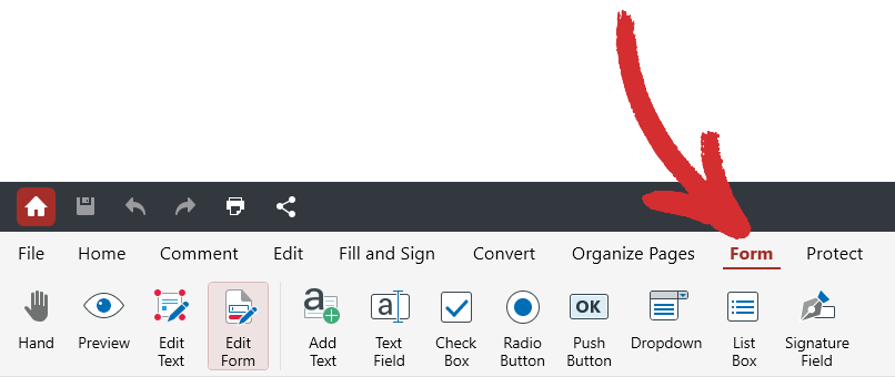
 “Hand”: seamlessly drag the view around your form.
 “Preview”: preview your custom form the way a user would see it.
 “Edit Text”: edit just the text-based portion of your forms.
 “Edit Form”: edit only your added form elements (fields, dropdowns, etc.).
 “Add Text”: insert custom text within your forms.
 “Text Field”: add a fillable field anywhere within your form.
 “Check Box”: add a clickable checkbox anywhere within your form.
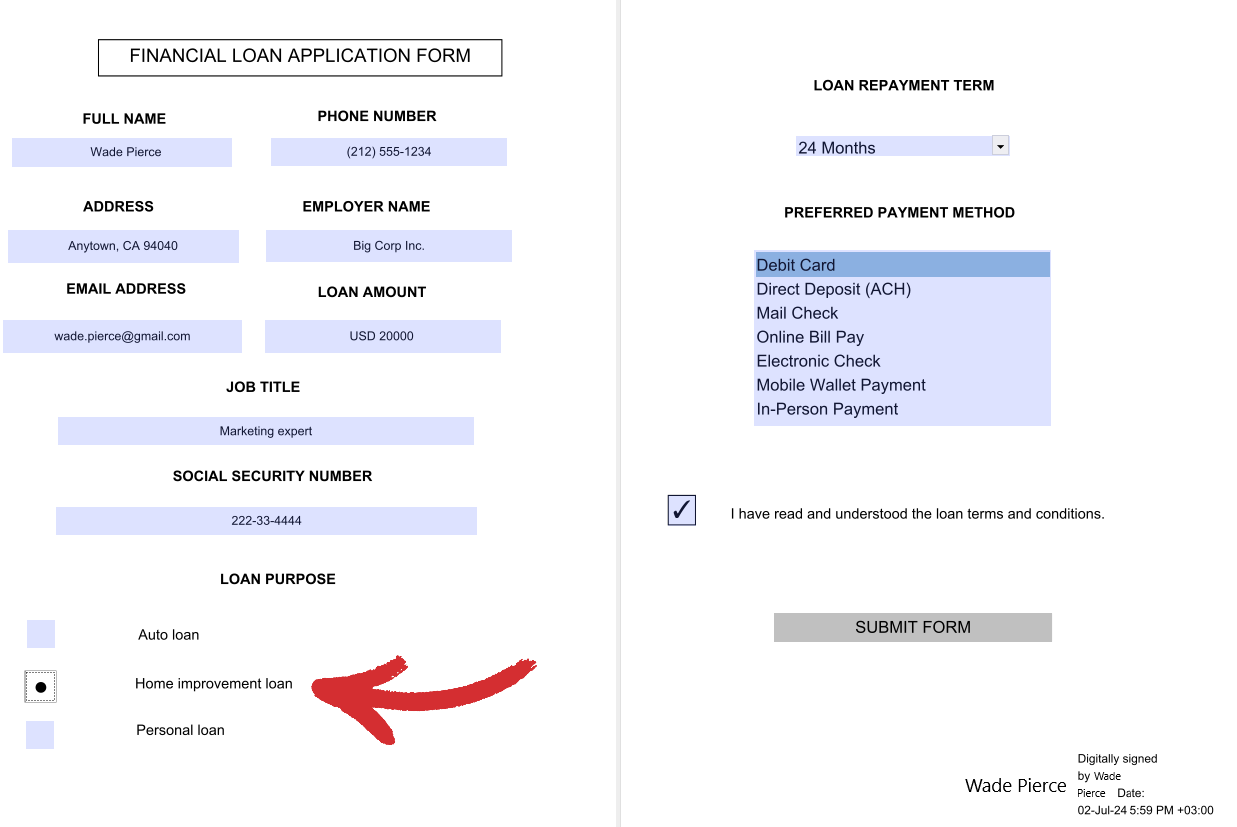
 “Radio Button”: add a clickable button anywhere within your form. Useful for multiple choice scenarios.
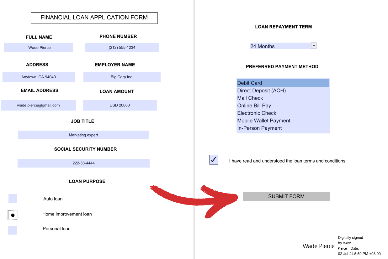
 “Push Button”: add a clear call to action to your user with a dedicated button.
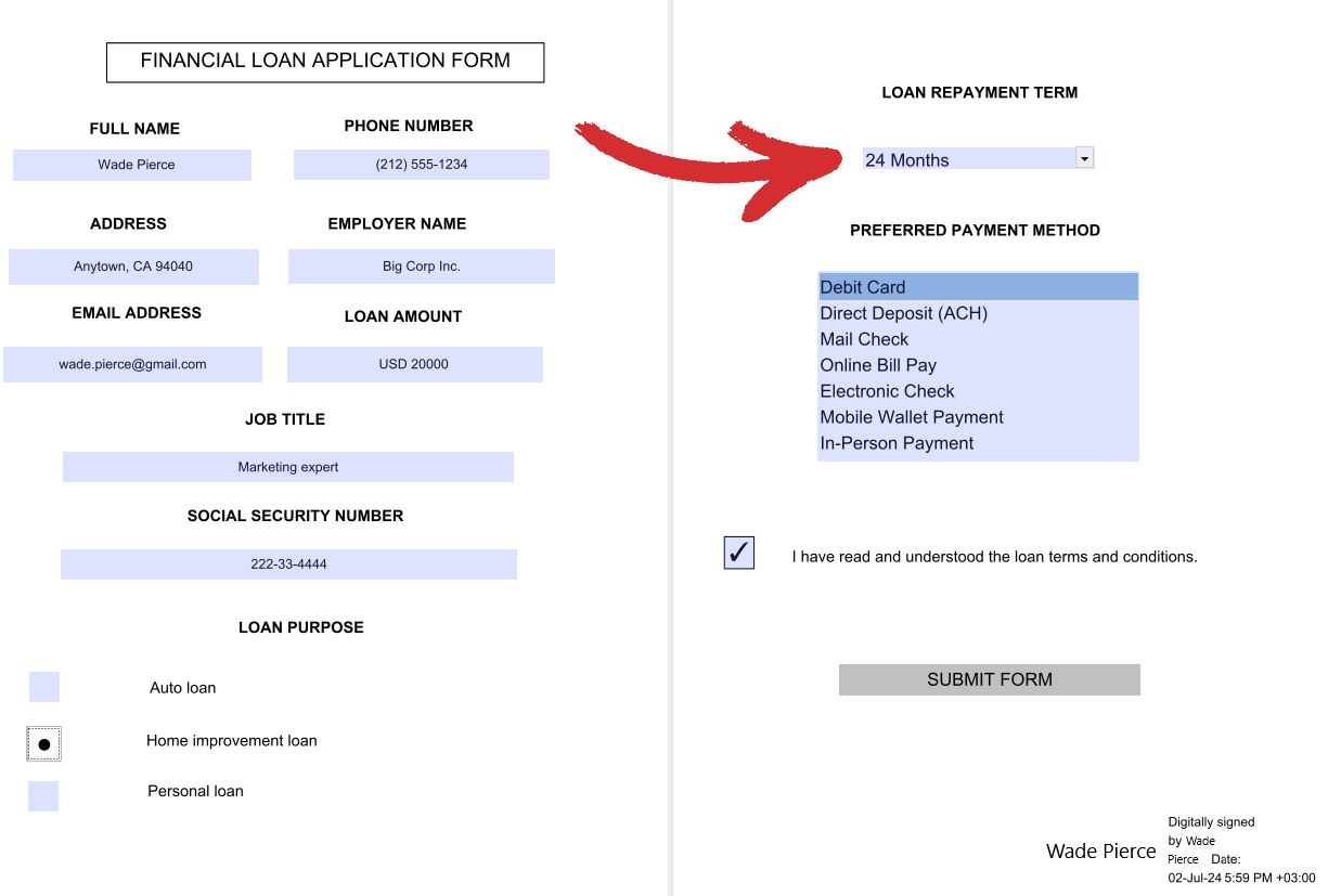
 “Dropdown”: add a dropdown list of items the user can choose from (single choice only).
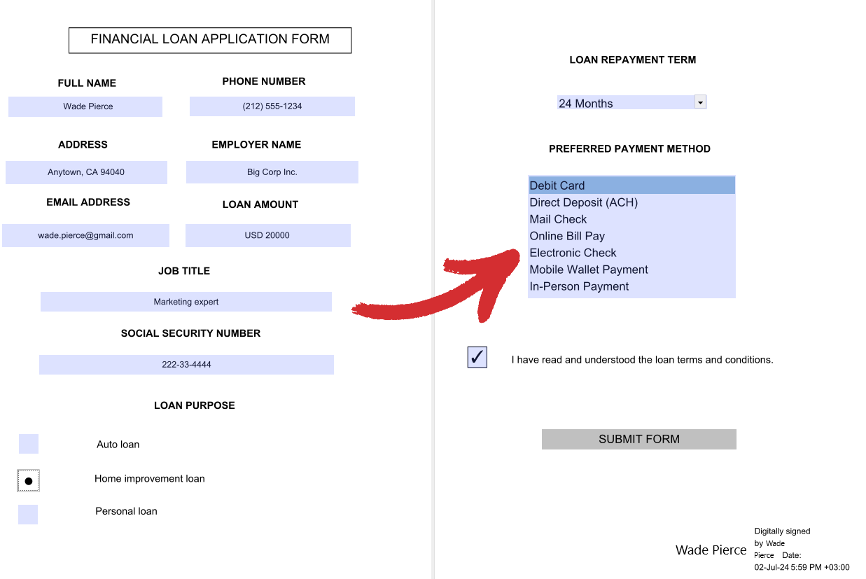
 “List Box”: add a static list of items with all options clearly visible to the user (multiple choice is allowed).
 “Signature Field”: digitally sign your form to prevent further content changes
 .
.
How to customize your forms
With MobiPDF, you can access a variety of personalization options to make your forms truly yours. While some of the options are shared between all form elements, many are unique to each specific type, so you need to have all the information upfront to craft a form that meets your project’s requirements with flying colors.
General tab
Applicable to all form elements. Here is a breakdown of all the options:
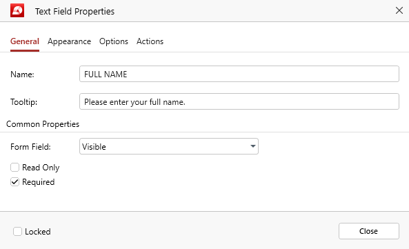
- “Name”: the name of your form. This name will also be used to describe data that is either imported or exported from your custom form.
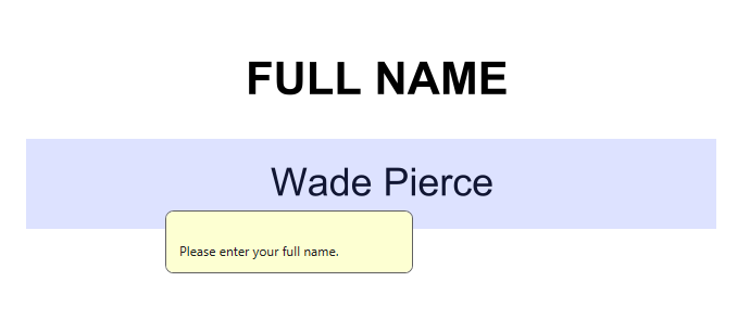
- “Tooltip”: gives users a helpful description when they hover over a form element (see example below).
Common Properties
- “Form Field”: specifies the general behavior of your form element. You can choose between “Visible”, “Hidden”, “Visible but doesn’t print”, and “Hidden but printable”.
- “Read Only”: prevents users from making any changes to your form element.
- “Required”: users cannot submit the form without addressing this form element first.
- “Locked”: prevents you or anyone else from changing the properties of your form element.
Appearance tab
Generally applicable to all form elements, with a few small exceptions (more on that a bit later). Here is a breakdown of all the options you can expect to find in this Forms tab.
Common Properties
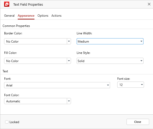
- “Border Color”: defines the color of the exterior form element border. You can choose between preset colors or create your own.
- “Line Width”: defines the thickness of the form element contours. You can choose between “Thin”, “Medium”, and “Thick”.
- “Fill Color”: defines the color of the fillable area within your form element. You can choose between preset colors or create your own.
- “Line Style”: defines the style of the form element contours. You can choose between “Solid”, “Dashed”, “Bevelled”, “Inset”, or “Underlined”.
Text
- “Font”: pick a custom font for your form element. MobiPDF has support for most common fonts, as well as exotic fonts.
- “Font size”: pick a custom font size for your form element.
- “Font Color”: pick a custom color for your font. You can choose between preset colors, create your own, or set it up to apply the appropriate color automatically.
- “Locked”: prevents you or anyone else from changing the properties of your form element.
However, like mentioned above, there are a few slight differences in this options panel, depending on the type of form element you’re customizing. These changes can be observed when setting up:
- Radio buttons and checkboxes: everything is the same except “Tick Color”, which goes in place of “Font Color”. You also cannot change the font type and size.
- Signature fields: you cannot change the font type and size.
Options tab
This is the heart of MobiPDF’s Forms functionality. This tab is different for each form element, with a single small exception that will be mentioned below.
Text Field
These are regular fillable fields that you can customize to match your project’s needs.
- “Alignment”: choose if you want to align your text to the left, right, or center.
- “Default Value”: defines the initial text displayed in the form which users can overwrite by typing.
- “Password”: masks the user-entered texts, showing it as a series of asterisks instead.
- “Multi-line”: allows the user to enter input spanning multiple lines.
- “Scroll long text”: automatically adjusts the size of the form to display all of the entered text.
- “Allow Rich Text Formatting”: enables users to enter text with styling options, like bold or italic.
- “Limit of”: limits the number of characters that users can enter.
- “Comb of”: spreads all of the characters evenly across the width of the form. Useful if your form contains things like social security or telephone numbers.
- “Locked”: prevents you or anyone else from changing the properties of your form element.
Check Box
Checkboxes are ideal for when you want to create lists of items where multiple items can be selected at once.
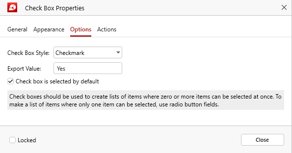
- “Check Box Style”: choose how your checkbox will look visually. You can select between “Checkmark”, “Circle”, “Cross”, “Diamond”, “Square”, and “Star”.
- “Export Value”: define the value that will be used for this form if the data is exported. The default value is “Yes”.
- “Checkbox is selected by default”: shows the checkbox as selected until the user it.
- “Locked”: prevents you or anyone else from changing the properties of your form element.
Radio Button
Radio buttons are the opposite of checkboxes in that they allow users to select a single option from multiple choices.
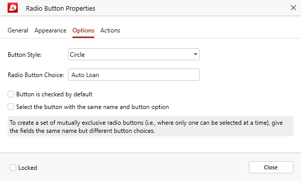
- “Button Style”: choose how your radio button will look visually. You can select between “Checkmark”, “Circle”, “Cross”, “Diamond”, “Square”, and “Star”.
- “Radio Button Choice”: give the radio button a unique name to set it apart from the remaining choices.
- “Button is selected by default”: shows the radio button as selected until the user clicks on another item.
- “Select the button with the same name and button option”: if this is enabled, then buttons with same form element names will be linked together and selected at the same time regardless of which linked item is clicked by the user.
- “Locked”: prevents you or anyone else from changing the properties of your form element.
Push Button
A clickable button that serves as a visible call-to-action for users, e.g. “Submit Form”.
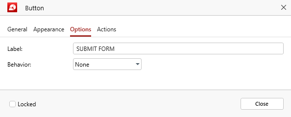
- “Label”: the text shown inside the body of the button. This usually describes its function or action.
- “Behaviour”: choose how you want the button to appear visually when clicked by the user. You can select between “None”, “Push”, “Outline”, and “Invert”.
- “Locked”: prevents you or anyone else from changing the properties of your form element.
Dropdown / List Box
Dropdowns and list boxes are great ways to narrow down the choice of your users while gathering valuable data. In MobiPDF, the Options tab is nearly identical for both form elements, except a single function, which is unique for both.
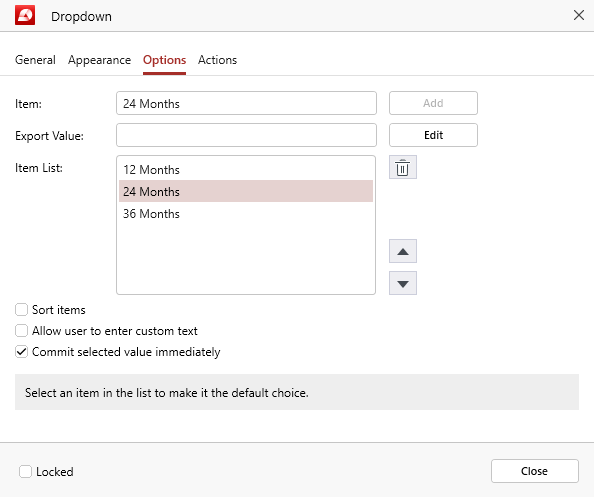
- “Item”: include text for every item that you want your dropdown list to have, then click “Add” for each item to include it in the “Item List”.
- “Export Value”: define the value that will be used for this item if the data is exported. If nothing is specified, this field will remain empty.
- “Item List”: this is the pool of available options from which the user can choose. Each time you click “Add”, a new item will be generated in the “Item List”. You can also choose the order in which each item appears on the list by clicking on the up and down arrows next to it or delete an item by clicking on the bin icon.
- “Sort items”: If this options is checked, then the list of all available choices will be sorted automatically for users.
- “Allow user to enter custom text” (unique for Dropdown): if you enable this, users will have the option to enter a custom response that is not on the list of predefined choices.
- “Multiple Selection” (unique for List Box): enable this to allow users to choose between multiple items from your predefined list.
- “Commit selected value immediately”: saves the value as soon as the user selects it. Under normal circumstances, this will happen only if the user clicks away from the form.
- “Locked”: prevents you or anyone else from changing the properties of your form element.
Signature Field
Digital signatures are a powerful security tool since they prevent tampering of your original form. In MobiPDF, the options tab for the signature form element is called “Signed”.
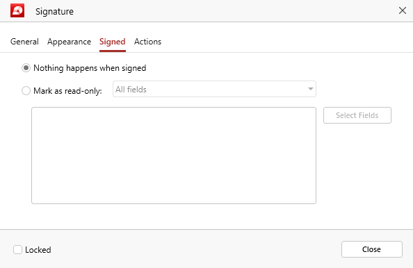
- “Nothing happens when signed”: choose this option if you want the form to remain unchanged when signed and allow the user to continue making changes.
- “Mark as read-only”: enable if you want some or all fields of your form to be marked as read-only when the form is signed, preventing the user from making any further changes. You can choose between “All fields”, “All fields except these”, and “Just these fields”. In the last two cases, you can click “Select Fields” to choose specific form fields to which you want this restriction to apply or which you want to exclude from it.
- “Locked”: prevents you or anyone else from changing the properties of your form element.
Actions tab
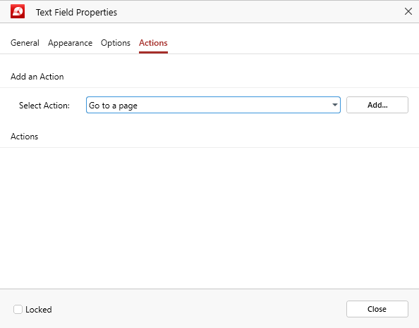
Applicable to all form elements. Here, you can set a customized behavior (actions), depending on your desired result. For example, you could set up a mandatory check box to link to a specific page within your document or open an external website when a user clicks a button.